Friday, Warren Buffet wrote an op-ed piece in the Wall Street Journal saying he was buying stocks for his personal portfolio. Some say this was a major reason why markets rose on Friday though they fell back to a modest loss by the end of the day.
Buffet made the point that stocks are now cheap and that he likes to buy when everyone else is fearful. The Wall Street Journal followed up with an article that looked at several measures that are commonly used to divine whether stocks are over-valued, fair-valued or under-valued. They provided the following graphic titled "The World is Cheap".
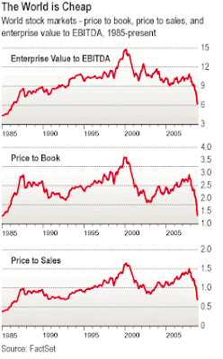 As can be seen in the three charts above, these indicators have fallen to levels not seen since the 1980's. In all three charts, the lower the reading, the more stocks can be considered to be under-valued. The article referenced at the bottom of this post provides a bit more detail on each chart.
And a few more charts won't hurt --
Well, there is plenty of evidence that stocks are getting cheap, depending where you look. Here are a few more charts, courtesy of InvestmentTools.com, that make the same point.
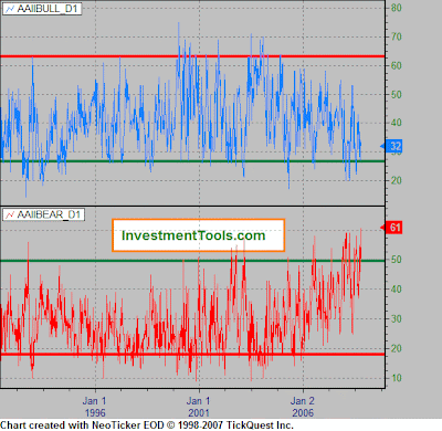
First up we have a sentiment indicator, Bullish and Bearish sentiment charts from the American Association of Individual Investors. According to many contrarians, when the AAII is most bearish, it generally corresponds to a bottom. Note that the bearish sentiment (in red) is reaching a 15-year maximum.
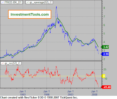
This next chart shows the price-to-book ratio for the Dow Jones Industrials. Where the first set of charts from the Wall Street Journal showed the same measure for world stocks, this chart makes the point that U.S. stocks are in exactly the same state: cheap.
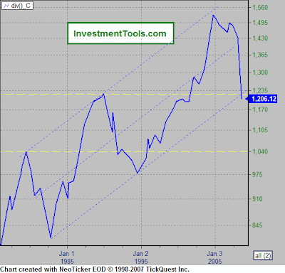
This last chart addresses a question that has been endlessly debated for the last year or two; ie, when will the housing market bottom? Here we see real estate prices adjusted by Consumer Price Index (CPI). This chart indicates that based on prices in general, housing has more or less returned to its long term trend line. The interpretation is that we are probably closer to the bottom in housing than we are to the top.
Conclusion --
The set of charts reviewed here certainly give the impression that we are in the range where stocks are cheap and even real estate is getting back to somewhere around fair value. With stocks getting the thumbs up from an investor like Warren Buffet, it makes sense to consider strategies that allow us individual investors to follow in Buffet's footsteps.
The easiest approach is to begin investing in a couple of ETFs or mutual funds that provide exposure to a major market index like the S&P 500 or the Wilshire 5000. Easing into the investment by spreading one's buying out over several months or a year reduces the impact of not identifying the absolute bottom yet assures that an investor gets in somewhere around the bottom.
This, of course, assumes that the current financial crisis and worldwide recession won't spin out of control and cause stocks to lose another 30%. Warren Buffet seems to think things won't get too much worse. How about you?
Sources: Before You Rush Into Cash…
Buffet made the point that stocks are now cheap and that he likes to buy when everyone else is fearful. The Wall Street Journal followed up with an article that looked at several measures that are commonly used to divine whether stocks are over-valued, fair-valued or under-valued. They provided the following graphic titled "The World is Cheap".
 As can be seen in the three charts above, these indicators have fallen to levels not seen since the 1980's. In all three charts, the lower the reading, the more stocks can be considered to be under-valued. The article referenced at the bottom of this post provides a bit more detail on each chart.
And a few more charts won't hurt --
Well, there is plenty of evidence that stocks are getting cheap, depending where you look. Here are a few more charts, courtesy of InvestmentTools.com, that make the same point.
First up we have a sentiment indicator, Bullish and Bearish sentiment charts from the American Association of Individual Investors. According to many contrarians, when the AAII is most bearish, it generally corresponds to a bottom. Note that the bearish sentiment (in red) is reaching a 15-year maximum.

This next chart shows the price-to-book ratio for the Dow Jones Industrials. Where the first set of charts from the Wall Street Journal showed the same measure for world stocks, this chart makes the point that U.S. stocks are in exactly the same state: cheap.

This last chart addresses a question that has been endlessly debated for the last year or two; ie, when will the housing market bottom? Here we see real estate prices adjusted by Consumer Price Index (CPI). This chart indicates that based on prices in general, housing has more or less returned to its long term trend line. The interpretation is that we are probably closer to the bottom in housing than we are to the top.

Conclusion --
The set of charts reviewed here certainly give the impression that we are in the range where stocks are cheap and even real estate is getting back to somewhere around fair value. With stocks getting the thumbs up from an investor like Warren Buffet, it makes sense to consider strategies that allow us individual investors to follow in Buffet's footsteps.
The easiest approach is to begin investing in a couple of ETFs or mutual funds that provide exposure to a major market index like the S&P 500 or the Wilshire 5000. Easing into the investment by spreading one's buying out over several months or a year reduces the impact of not identifying the absolute bottom yet assures that an investor gets in somewhere around the bottom.
This, of course, assumes that the current financial crisis and worldwide recession won't spin out of control and cause stocks to lose another 30%. Warren Buffet seems to think things won't get too much worse. How about you?
Sources: Before You Rush Into Cash…
Comments
Post a Comment