 Should investors be worried?
Stocks actually closed with losses this week. This is something we haven't seen much of lately so every time it happens, I begin to think maybe this is finally the long awaited pullback.
Certainly, price action in the stock market was not particularly reassuring. Despite a sequence of better than expected earnings from most companies and some spectacular earnings from the likes of Apple (AAPL) and Amazon.com (AMZN), stocks were unable to shake off the blahs. The three major averages lost a fraction of a percent, most of it on Friday. Small-caps got spanked as the Russell 2000 lost a big 2.5%
Economic reports presented a so-so picture of the U.S. struggling to rebound. Initial jobless claims were the big disappointment, rising again after economists predicted a decrease. Coupled with an upward revision of the previous week's numbers, it confirmed that the job market could be much worse than merely a lagging indicator. Real estate also showed that it didn't know which way was up as Existing Home Sales came in higher than expected while Housing Starts and Building Permits were lower.
Let's review some charts and see if the worry is justified.
The view from Alert HQ --
Charts of some of the statistics we track at Alert HQ are presented below:

This first chart tracks our moving average analysis. The count of stocks above their 50-DMA (the yellow line) is decreasing. The line has also again failed to cross above the magenta line which tracks the number of stocks whose 20-DMA is above their 50-DMA. This is a bearish setup that is developing. The only hopeful indication is that the number of stocks tracked by both of these lines are still at reasonably high levels.
The next chart provides our trending analysis. It looks at the number of stocks in strong up-trends or down-trends based on Aroon analysis.

Here we see that barely 30% of stocks can be considered to be in strong up-trends. This is not the kind of level we have previously seen at market tops or at market bottoms. According to this indicator, we are stuck in no man's land. As the number of stocks in strong down-trends is starting to show a bit of an uptick and the number of stocks in up-trends drops, it suggests that the underpinnings of this rally are weakening.
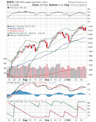
Looking at the S&P 500 as a proxy for the market, things actually don't look too bad. Up-trend is intact and Aroon indicates it's a reasonably strong trend. All the moving averages are moving up in concert and the index hasn't even broken below the 20-DMA. This implies the major trend remains solidly positive though a short-term downswing could easily be in the offing.

Indeed, stocks seem to be topping out on a short-term basis. MACD is providing a glimmer of confirmation. The overall trend of MACD has been going down while stock prices have been going up. This is a divergence that many investors believe presages a turn in the trend. The faster moving average (black line) has just fallen below the slower moving average (red line). This is a classic short-term bearish setup.
Conclusion --
I've used the phrases "short-term" and "primary trend" several times in this post and for good reason. Investors need to separate the two and understand how their trading strategy plays into this dichotomy. The evidence today seems to be pointing to a short-term pullback, beginning about now. On the other hand, it is hard to think that such a pullback would be a threat to the primary long-term trend which thus far is solidly up.
Consider the outcome of a pullback that more or less looks like the last three pullbacks. This would result in the S&P 500 dropping to the range between 1030 and 1040. This implies a drop of another 4% of so from here. This would confirm the 50-DMA as support, leave the primary up-trend intact and suggest that this pullback should be looked at as a buying opportunity.
So am I worried? Maybe a little bit but so far stocks just seem to be following the usual ebb and flow.
Comments
I join. And I have faced it. Let's discuss this question. Here or in PM.
Post a Comment