Outside of the stock market, it was actually a pretty decent week. Here are some of the better things that happened:
Investors continued to take a "sell the news" attitude toward company earnings this week. Nothing was good enough to generate broad-based buying. It was even worse in the tech sector - the introduction of the iPad from Apple, good earnings from Apple, Microsoft, SanDisk, VMWare, Texas Instruments, Cypress Semiconductor and others - all any of it led to was selling.
So we continue to navigate an economic environment that is not great but for the most part is getting better. What should stocks do in such a situation? It can argued that they should not go straight up. And thus, we find ourselves in the middle of a pullback.
Just how bad the pullback is will be discussed below. The following charts are derived from data collected during our Alert HQ process and they provide a high-level look at a couple of the indicators we track across the whole market.
The view from Alert HQ --
Let's start with our moving average analysis.

For this first chart we count the number of stocks above various moving averages and count the number of moving average crossovers, as well. We scan roughly 7000 stocks and ETFs each weekend and plot the results against a chart of the SPDR S&P 500 ETF (SPY).
For the second week in a row, the yellow line has plunged, signifying that the number of stocks above their 50-DMA is declining precipitously. Only 39% of the stocks and ETFs we scan are above this important moving average. Crossovers to the downside have increased rapidly this week, as well. Now only 60% of stocks still have their 20-DMA above their 50-DMA. This shows how fast stocks have fallen - their moving averages are barely able to keep up with the change in direction. Though not shown on the charts, fully 71% of stocks and ETFs have fallen below their 20-DMA.
The next chart provides our trending analysis. It looks at the number of stocks in strong up-trends or down-trends based on Aroon analysis.
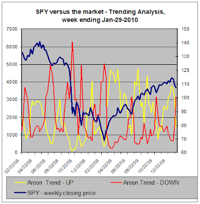
This chart shows a crossover of its own. The number of stocks in strong up-trends has fallen well below the number of stocks in strong down-trends. Even though Aroon tends to be a slow moving, lagging indicator, you can see how rapidly these numbers have changed over the last few weeks and it demonstrates how broad-based and severe the declines have been each week.
Interpreting the charts --
Using the charts to look at what has already transpired, we can see that we are in the midst of a significant pullback and that this pullback is not limited to just a few sectors. The numbers suggest every sector is under pressure.
Looking forward, though, is always the fun part. I'm going to go out on a limb here and make a prediction: this pullback doesn't have too much farther to go.
All the indications on the charts above suggest this market will soon approach the oversold levels from which we have generally bounced back. The yellow lines on both charts are reaching lows from which stocks stocks begin to recover. And similarly, the red line in the Trending Analysis chart will soon be reaching a high enough level from which it can be expected to recede.
In other words, markets seldom get to a point where every single stock is performing horribly. Usually we just have to get to a point where most of them are performing poorly before we get a bounce back. And if the economy is trending toward improvement, the expectation for a bounce back is that much stronger. If it's always darkest before the dawn, I think glimmers of light may be just over the horizon.
Is this analysis supported by any standard technical analysis? Let's look at a chart of the Total Market VIPERs ETF (VTI) which I use to represent the overall market and corresponds more or less with the population of stocks that I scan.
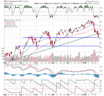
The chart, based on daily data, shows the support levels and the trend line that I believe are currently in play. You can see that VTI has already fallen below the green trend line. It is sitting right on the first blue support line and is just a couple of bucks away from the next lower blue support line.
The chart also demonstrates how bearish both Aroon and MACD are at the moment. Note, however, that Williams %R, the indicator at the top of the chart, shows VTI to be about as oversold as it has been in months. This doesn't mean that the market will immediately begin to recover but it does suggest that further damage may be limited.
Conclusion --
So we have a haltingly improving economy, decent enough earnings, though many companies are still being helped by cost cutting, and decent forward guidance from management though many are still cautious. And yet, all we see are stocks falling.
The question is - where is the equilibrium point for stocks? If stocks were really priced for perfection before this pullback, where should they be now that earnings and management expectations are clearer? That's an answer that only the market can provide.
Later this week we will see the Nonfarm Payrolls Report. The timing and importance of this market moving-report is liable to be the catalyst that will determine whether the pullback continues or whether it has run its course. Stay tuned...
- Ben Bernanke was re-appointed and, contrary perhaps to how many bloggers felt, investors were relieved
- 4th quarter GDP did indeed come in very strong, at 5.7%
- Chicago PMI beat expectations and that was notable because the employment component finally showed outright growth instead of slowing decline
- Continued good earnings reports from bellwethers like Amazon and Microsoft
- Consumer sentiment increased according to the University of Michigan survey
- The Fed kept interest rates steady and language in their policy statement indicated they would continue to do so for some time to come.
- The Durable Goods report for December showed gains in new orders, rising for the first time since September
- Weekly jobless claims declined
- Housing still stinks as reports on new home sales and existing home sales continued at weak levels
- The Durable Goods report may have been positive but it missed analyst expectations
- Weekly jobless claims declined but not as much as anticipated and this followed two weeks of increases
- International concern over the finances of major countries grew, with the sovereign debt of Greece still in the headlines and then Standard & Poor commenting that it "no longer classifies the United Kingdom among the most stable and low-risk banking systems globally."
Investors continued to take a "sell the news" attitude toward company earnings this week. Nothing was good enough to generate broad-based buying. It was even worse in the tech sector - the introduction of the iPad from Apple, good earnings from Apple, Microsoft, SanDisk, VMWare, Texas Instruments, Cypress Semiconductor and others - all any of it led to was selling.
So we continue to navigate an economic environment that is not great but for the most part is getting better. What should stocks do in such a situation? It can argued that they should not go straight up. And thus, we find ourselves in the middle of a pullback.
Just how bad the pullback is will be discussed below. The following charts are derived from data collected during our Alert HQ process and they provide a high-level look at a couple of the indicators we track across the whole market.
The view from Alert HQ --
Let's start with our moving average analysis.

For this first chart we count the number of stocks above various moving averages and count the number of moving average crossovers, as well. We scan roughly 7000 stocks and ETFs each weekend and plot the results against a chart of the SPDR S&P 500 ETF (SPY).
For the second week in a row, the yellow line has plunged, signifying that the number of stocks above their 50-DMA is declining precipitously. Only 39% of the stocks and ETFs we scan are above this important moving average. Crossovers to the downside have increased rapidly this week, as well. Now only 60% of stocks still have their 20-DMA above their 50-DMA. This shows how fast stocks have fallen - their moving averages are barely able to keep up with the change in direction. Though not shown on the charts, fully 71% of stocks and ETFs have fallen below their 20-DMA.
The next chart provides our trending analysis. It looks at the number of stocks in strong up-trends or down-trends based on Aroon analysis.

This chart shows a crossover of its own. The number of stocks in strong up-trends has fallen well below the number of stocks in strong down-trends. Even though Aroon tends to be a slow moving, lagging indicator, you can see how rapidly these numbers have changed over the last few weeks and it demonstrates how broad-based and severe the declines have been each week.
Interpreting the charts --
Using the charts to look at what has already transpired, we can see that we are in the midst of a significant pullback and that this pullback is not limited to just a few sectors. The numbers suggest every sector is under pressure.
Looking forward, though, is always the fun part. I'm going to go out on a limb here and make a prediction: this pullback doesn't have too much farther to go.
All the indications on the charts above suggest this market will soon approach the oversold levels from which we have generally bounced back. The yellow lines on both charts are reaching lows from which stocks stocks begin to recover. And similarly, the red line in the Trending Analysis chart will soon be reaching a high enough level from which it can be expected to recede.
In other words, markets seldom get to a point where every single stock is performing horribly. Usually we just have to get to a point where most of them are performing poorly before we get a bounce back. And if the economy is trending toward improvement, the expectation for a bounce back is that much stronger. If it's always darkest before the dawn, I think glimmers of light may be just over the horizon.
Is this analysis supported by any standard technical analysis? Let's look at a chart of the Total Market VIPERs ETF (VTI) which I use to represent the overall market and corresponds more or less with the population of stocks that I scan.

The chart, based on daily data, shows the support levels and the trend line that I believe are currently in play. You can see that VTI has already fallen below the green trend line. It is sitting right on the first blue support line and is just a couple of bucks away from the next lower blue support line.
The chart also demonstrates how bearish both Aroon and MACD are at the moment. Note, however, that Williams %R, the indicator at the top of the chart, shows VTI to be about as oversold as it has been in months. This doesn't mean that the market will immediately begin to recover but it does suggest that further damage may be limited.
Conclusion --
So we have a haltingly improving economy, decent enough earnings, though many companies are still being helped by cost cutting, and decent forward guidance from management though many are still cautious. And yet, all we see are stocks falling.
The question is - where is the equilibrium point for stocks? If stocks were really priced for perfection before this pullback, where should they be now that earnings and management expectations are clearer? That's an answer that only the market can provide.
Later this week we will see the Nonfarm Payrolls Report. The timing and importance of this market moving-report is liable to be the catalyst that will determine whether the pullback continues or whether it has run its course. Stay tuned...
Comments
Post a Comment